PDA interface keeps a low profile
By Kimberly Patch, Technology Research NewsAlthough humans are capable of doing several things at once, it's nice to be able to concentrate on, say, an 18th-century artifact without having to interrupt the experience to curse at a piece of electronic gadgetry that promised to give you more information about the artifact.
With that in mind, a team of researchers at Xerox tested a personal digital assistant (PDA) interface on tourists at a historic house, including those who said they did not get along well with computers.
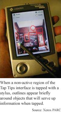
The Tap Tips guidebook interface is simply a picture of the part of the historic house that a person is looking at. For information on an artifact, the person uses the PDA stylus to tap on the picture.
The historic house was a challenge because, unlike a "buy" button on a Web site, it was not obvious that some of the objects pictured on the guidebook screen could be relevant. "In a house, something as simple as a ladder in a library to get up to books might be a historically interesting object," said Paul Aoki, a computer scientist at the Xerox Palo Alto Research Center.
However, giving the museum goers that explicit cue on the screen would require either having them remember how to turn the cue on and off, or make the cue permanent, which would ruin the picture and the flow of the experience, he said.
The researchers solved the problem simply. Although there's nothing on the interface to tell a person where to tap, touching a place that does not harbor information causes outlines to appear briefly on the objects that do yield information. Because the outlines appear only when they are needed, then fade on their own, no knowledge is required to turn them on and off.
"The point is when... you're trying to make [an interface] very simple for people to understand, the more of those special-purpose little buttons and gadgets and widgets on the screen that you have to understand, the more difficult it is... to remember them all," Aoki said.
The interface turned out to be intuitive, allowing museum goers to spend more time looking at the artifacts. "We did a usability study which showed that people -- some of them self-described technophobes -- were able to stay in that visual mode where they were looking at things and... asking the computer about things without being distracted by the interface," said Aoki.
Although the information was available in both text and audio forms on the Tap Tips Guidebook, museum goers preferred the audio version, Aoki said.
The study yielded some further interesting results. With the museum goers free from computer gadgetry angst, they began to use the interface in ways the researchers hadn't expected.
Instead of simply listening to their own guidebooks, the museum goers began to share, incorporating the audio from the device into a conversation. "We found that people actually use the devices as a tool to interact with each other [and] share information. They treated the combination of a conversation with a friend, [the] things that they were hearing in their own guidebooks and the things that they were able to overhear from the friend's guidebooks [as a whole environment] that contributed to not only their understanding... but it changed the way in which they interacted with their friends," said Aoki.
In a larger context, the researchers gained a strong lesson from the study, said Aoki. "It makes you sit back and look at the way you've programmed these things -- you don't necessarily just want to stick with the mechanisms that are provided by the tool kits that the vendors supply. It may take some creativity in order to come up with interaction mechanisms that are specific to the task and intuitive for the task... it may be okay to not use something exactly like what we use on a computer with a mouse and a screen," he said.
The Tap Tips type of interface is a logical step for Palm-type interfaces, said Jodi Forlizzi, assistant professor of human-computer interaction and design, at Carnegie Mellon University. It will likely prove more useful as handheld computers continue to percolate throughout society, she said. "The biggest challenge for PDAs and cell phones is that the devices need to be usable in mobile contexts -- often while the user's attention is divided by another task [like] walking [or] driving."
The interface addresses two important trends in human-computer interaction research, said Forlizzi. "One, to try to understand the contexts in which mobile applications might work, so as to make their interfaces more usable; and two, understanding how dynamic graphical information could make information more salient to the user," she said.
The Xerox researchers are now working on a system that will facilitate information sharing in a public place while not impinging on the experience of others, according to Aoki. "The question is how can you share with just the people you're interested in sharing with. We think technology can help with this. We're still at an exploratory phase. The approaches we envision have very lightweight visual mechanisms... combined with audio presentation of the information," he said.
Aoki's research colleagues were Amy Hurst and Allison Woodruff of Xerox Palo Alto Research Center. A pair of technical papers on the research have been accepted for presentation at the Association for Computing Machinery (ACM) Conference on Human Factors in Computing Systems (CHI 2001) in Seattle, Washington, March 31-April 5, 2001. The research was funded by Xerox.
Timeline: Now
Funding: Corporate
TRN Categories: Human-Computer Interaction
Story Type: News
Related Elements: Technical papers, "Tap Tips: Lightweight Discovery of Touch Screen Targets" and "The Guidebook, the Friend and the Room: Visitor Experience in a Historic House," ACM Conference on Human Factors in Computing Systems (CHI 2001) in Seattle, Washington, March 31-April 5, 2001. Technical paper, "Improving Electronic Guidebook Interfaces Using a Task-Oriented Design Approach," Association for Computing Machinery (ACM) Conference on Designing Interactive Systems (DIS 2000), New York, August 17- 19, 2000.
Advertisements:
February 21, 2001
Page One
Artificial cells make mini lab
PDA interface keeps a low profile
Software sifts text to sort Web sites
Light drives microscopic metal gears
Quantum computer design lights dots

News:
Research News Roundup
Research Watch blog
Features:
View from the High Ground Q&A
How It Works
RSS Feeds:
News
Ad links:
Buy an ad link
| Advertisements:
|
 |
Ad links: Clear History
Buy an ad link
|
TRN
Newswire and Headline Feeds for Web sites
|
© Copyright Technology Research News, LLC 2000-2006. All rights reserved.