Rough
tools smooth design
By
Kimberly Patch,
Technology Research NewsIt's clear that the computer is not the best tool for every step of a design process despite its organizational advantages.
Many designers, from architects to Web interface builders, use pencil and paper during the initial stages of creating a design. One reason is that a design that is laid out neatly on a computer looks done, which is an impression that squelches the creative process. The workings of a computer can get in the way as well, especially with interfaces like speech recognition that regularly produce mistakes.
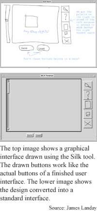
One group of researchers has created three tools that sidestep these drawbacks by allowing computer interface designers to create rough designs on a computer. Silk is a tool for graphic designers, Denim a tool for Web site designers and Suede a tool for designing speech interfaces. What they have in common are interfaces that make it clear that the project is an early draft, and that eliminate technical issues that tend to get in the way of creativity.
"There's been a lot of work that shows that if the designer uses a pen or pencil on paper, they're more creative than someone who uses... a drawing program," said James Landay, an assistant professor of electrical engineering and computer sciences at the University of California at Berkeley. "The reason is that the ambiguity in the sketch actually encourages them to look at more ideas, and in the early stages of a design it's really important to be creative and to look at many different approaches," he said.
The same goes with designers showing clients rough ideas, said Landay. "A sketch... communicates that the idea is rough and unfinished and open to suggestion and also gets them to focus on those high-level issues," he said.
Conversely, when a designer shows a client something on a computer, "it looks done so they tend to focus on small visual details that are important at some stage but not in the early stages where you're trying to get high-level feedback," he said.
But there are also reasons to design on a computer, Landay said. "It's easy to edit, easy to reuse... easy to track different versions [and] easy to test, because when it's on a computer we can actually turn it into something that runs and test it with people... whereas on paper we just have to pretend," he said.
Silk allows a designer to literally sketch out an interface that works, meaning when a scribbled button is clicked, the button will execute an action. "You can actually try them out and see if they make sense, as well as show them to other people to illustrate how [the interface] is intended to work," said Landay.
The Silk tool, which was Landay's first project, goes the extra step of converting the sketch interface to a finished interface when the designer is done with the project. The other two tools don't include this step, however, because the conversion wasn't very useful for the designers, he said. "It's interesting from a computer science perspective but it's not as important to the designers," said Landay. Once the designers finish and test a design in run mode to see that it works properly, they are likely to switch to a Web building tool anyway, he said.
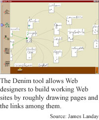
Denim is a similar tool for Web interfaces that keeps track of how different pages, which can be roughly sketched out, link to each other. "We found that [Web designers] were using three different representations -- storyboards, site maps and pages, and they had to use different tools for all of them. The idea was to unify these different representations all on one interface in one screen and use zooming as a way of moving between them," said Landay.
A slider bar allows the designer to zoom in to see a single page and out to see a site map. "Arrows represent how [different pages] are related. [When] you zoom into an individual page, you can just draw on the page," he said. The interface recognizes the arrows, and has a run mode where it works like a Web browser. "You can save this in HTML and run it as a Web browser, but it will look... sketched," said Landay.
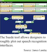
Suede brings the same basic ideas to designing voice interfaces. What gets in the way of being creative in designing a voice interface is the technology of speech recognition, which doesn't always work perfectly. "Often these technologies lead you to start having a conversation with [the speech recognition software] rather than focusing on your task," said Landay.
The interface sidesteps speech technology snafus simply by not using speech recognition at all. Instead, it uses something speech interface designers have historically used before they put a design on a computer. "The Wizard of Oz method... means someone pretends to be the computer... to test the interface," said Landay.
Suede allows the designer to organize what the system will say by mapping out the different prompts and responses on the screen. It also facilitates test sessions where a person is acting as the voice recognizer, then analyzes the data. "There's no speech recognition, there's no speech synthesis. We can still design something really rapidly, and that's what's in common [between Suede] and the sketching systems that we built," said Landay.
The next step is making the interfaces multimodal, said Landay. This would allow for two different types of input, like speech and pointing, at the same time. For example, a person could point to something with a pen and at the same time say 'move this here.'
The idea behind all three projects is to adapt computers to the way people work naturally instead of the other way around, he said. "My argument is that most computer programs and applications make us operate on the terms of the computer [where] everything is precise."
They're neat applications, said Terry Winograd, a professor of computer science at Stanford University. "What [Landay has advanced] is using informal things that actually work. The main issue here is the faster the feedback cycle, the more iterations you can do, [and so] the more you can debug your ideas as you develop them," he said.
"There's a whole body of work on prototyping techniques that emphasize things like informal sketching and ways of getting feedback from users based on various early designs" that usually involve media like paper, video and flipbooks, Winograd said.
The researchers' work brings a similar type of prototyping to computers "in a particular way -- combining informal sketching with computer response," said Winograd. It is easy with some combination of techniques to go through the same process that the interface design tools enable, but the tools may allow you to learn more with less work, he added.
Landay's research colleague for the Silk project was Brad Myers of Carnegie Mellon University. They published the research in the March, 2001 issue of IEEE Computer. Landay worked with Berkeley graduate students Mark Newman, James Lin, and Jason Hong on Denim, and Scott Klemmer, Anoop Sinha, and Jack Chen on Suede. The Silk project was funded by the Department of Defense (DOD) and Fuji Xerox Palo Alto Laboratories (FX Palo). The Denim project was funded by NEC, Qualcomm, and FX Palo. The Suede project is funded by SRI International, FX Palo, and the National Science Foundation (NSF).
Timeline: Now
Funding: Corporate, Government
TRN Categories: Software Design and Engineering; Human-Computer Interaction
Story Type: News
Related Elements: Technical paper, "Sketching Interfaces: Toward More Human Interface Design," March, 2001, IEEE Computer. More information on the projects, including the videos of the interfaces in action and a downloadable version of Denim, is available at guir.berkeley.edu
Advertisements:
May 16, 2001
Page One
Rough tools smooth design
Tightening photonic bonds strengthens security
Tunable superconductor makes better circuits
Flexible film turns heat to power
Natural force drives molecular ratchet


News:
Research News Roundup
Research Watch blog
Features:
View from the High Ground Q&A
How It Works
RSS Feeds:
News
Ad links:
Buy an ad link
| Advertisements:
|
 |
Ad links: Clear History
Buy an ad link
|
TRN
Newswire and Headline Feeds for Web sites
|
© Copyright Technology Research News, LLC 2000-2006. All rights reserved.